
Acclivity

Details.

Logo Design | Website Design

Home / Project Detail

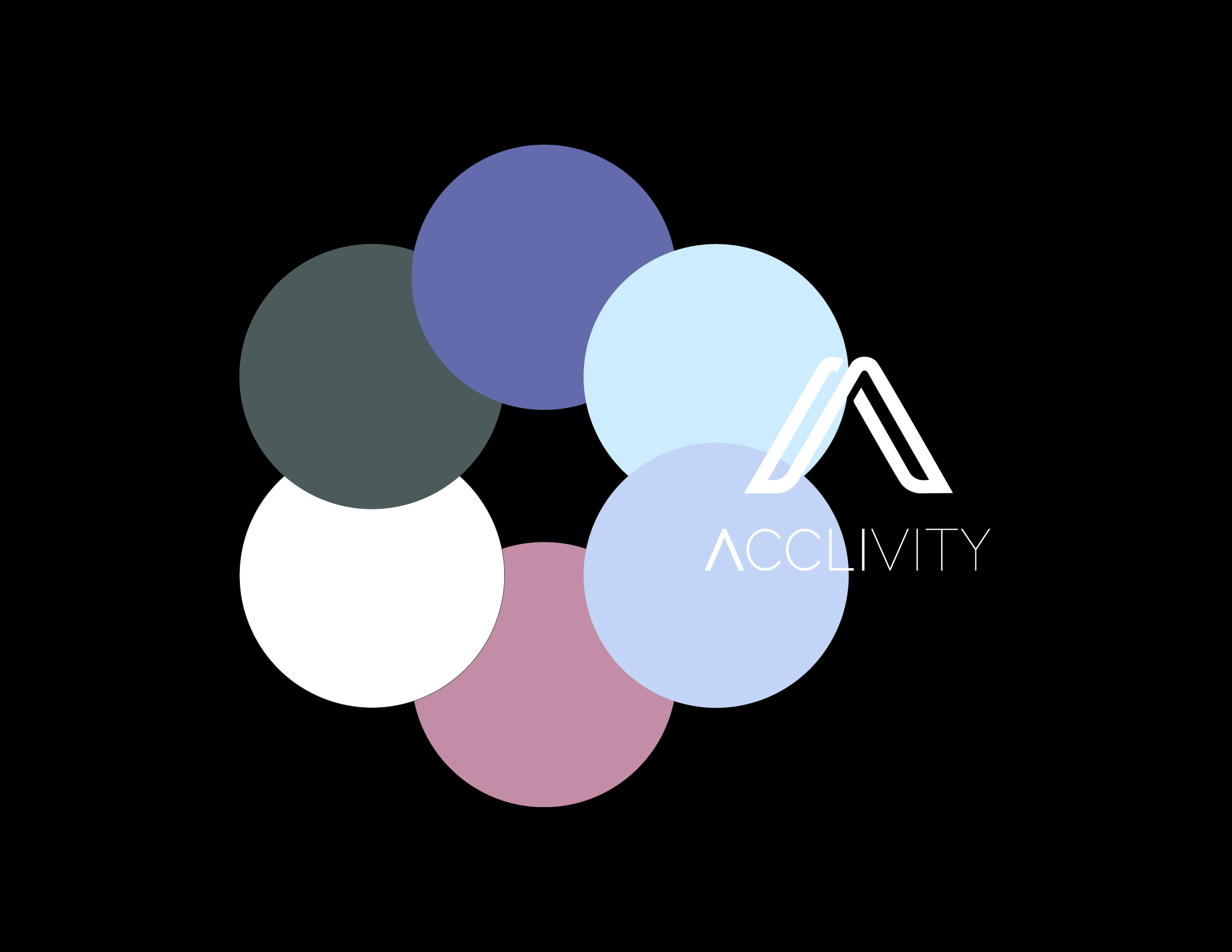
Color Palette

The color palette for Acclivity is a harmonious blend of muted tones designed to convey professionalism and sophistication. The primary colors include:

  • Purple (#75708C): A deep, calming shade that serves as the primary accent, providing a sense of stability and trust.
  • Blue Light (#C7DBF7): A soft, inviting hue that adds a touch of modernity and freshness.
  • Light Purple (#BFC7DE): Complements the primary purple, offering a cohesive and balanced look.
  • Peach (#C59594): Adds warmth and approachability, enhancing the overall palette with a subtle contrast.

Typography

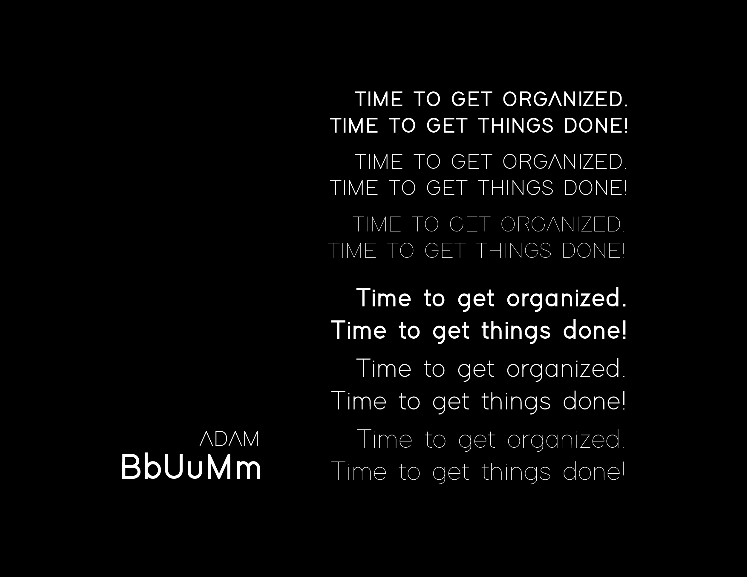
The typography is carefully chosen to ensure readability and elegance across various digital platforms:

  • Primary Font: Bold and modern, used for key headings to capture attention.
  • Secondary Font: Slightly lighter, perfect for subheadings and secondary information.
  • Text Font: Clean and straightforward, ensuring easy readability for body text.
  • Accent Font: Adds flair to special sections or call-to-action elements.

Logo Design

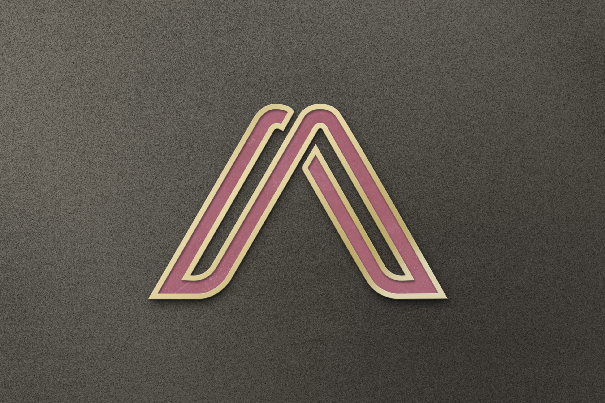
The Acclivity logo is designed to be versatile and impactful:

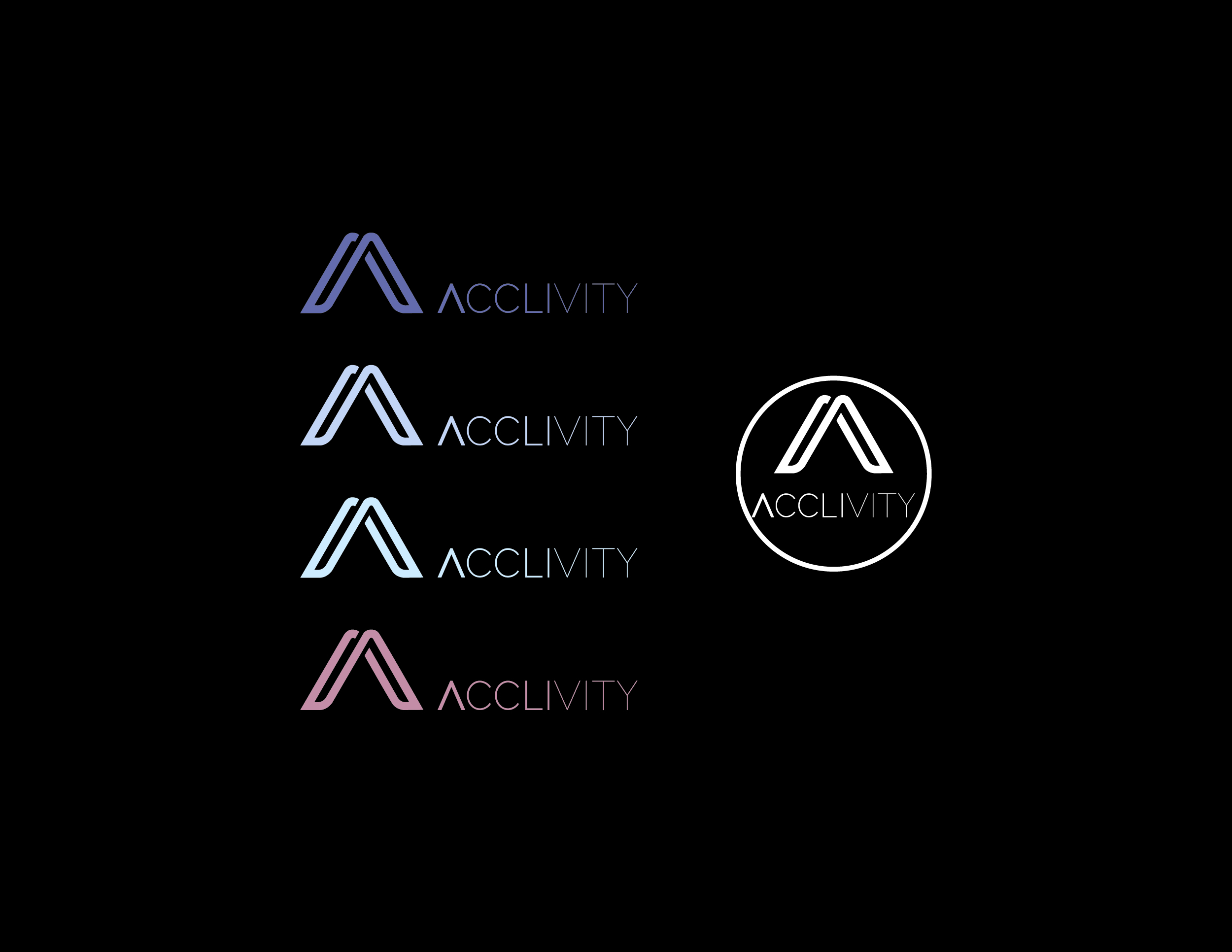
  • The logo features a stylized “A” that symbolizes upward movement, reflecting the company’s focus on growth and optimization.
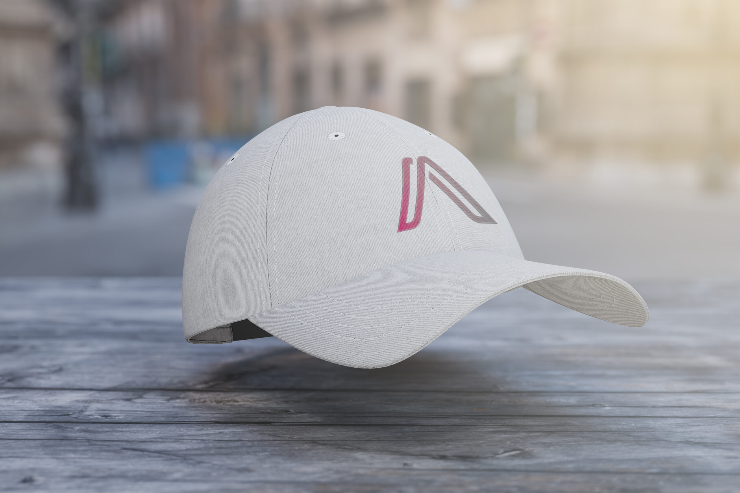
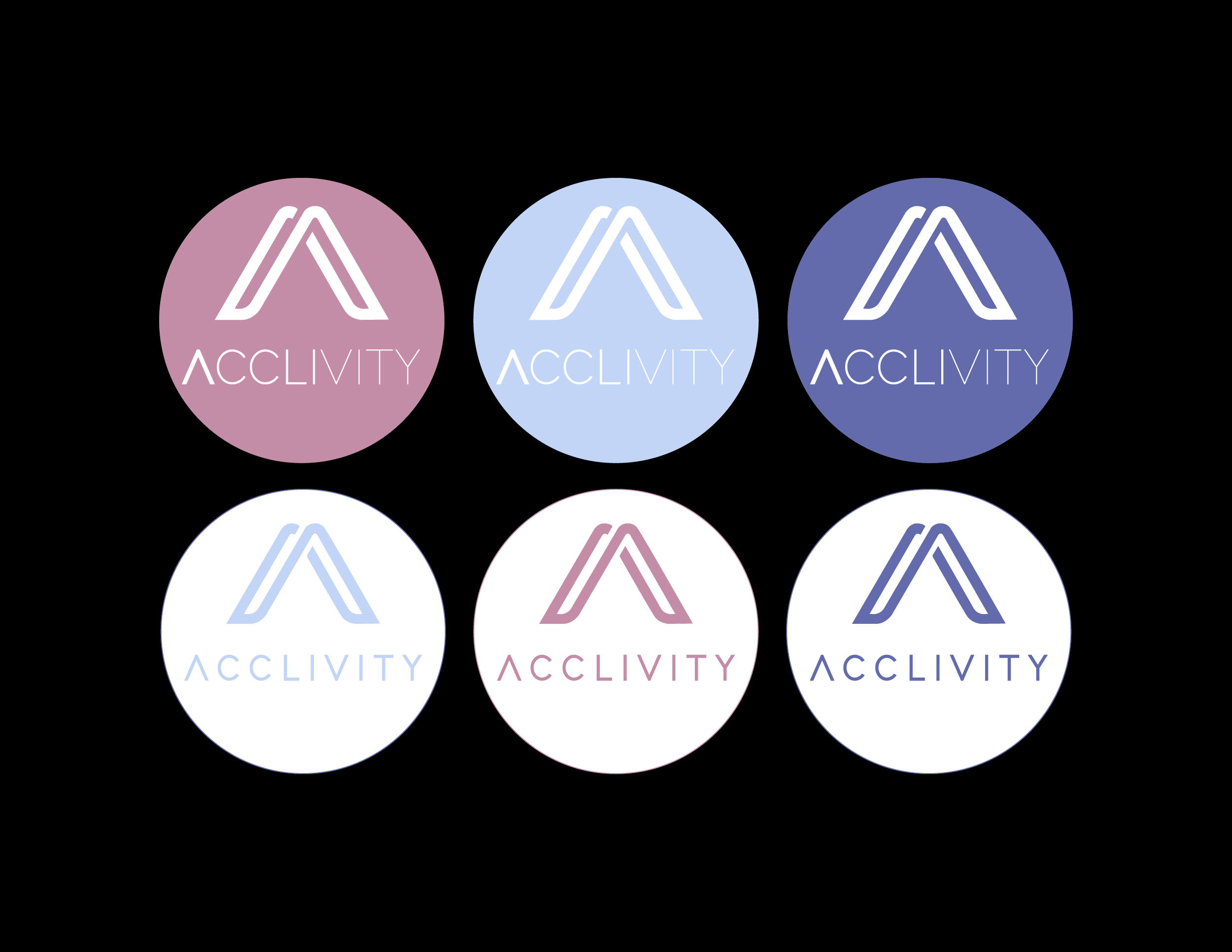
  • Variations of the logo are presented in each color from the palette, allowing flexibility in branding across different media.
  • The logo’s simplicity ensures it remains memorable and recognizable.

Website Design

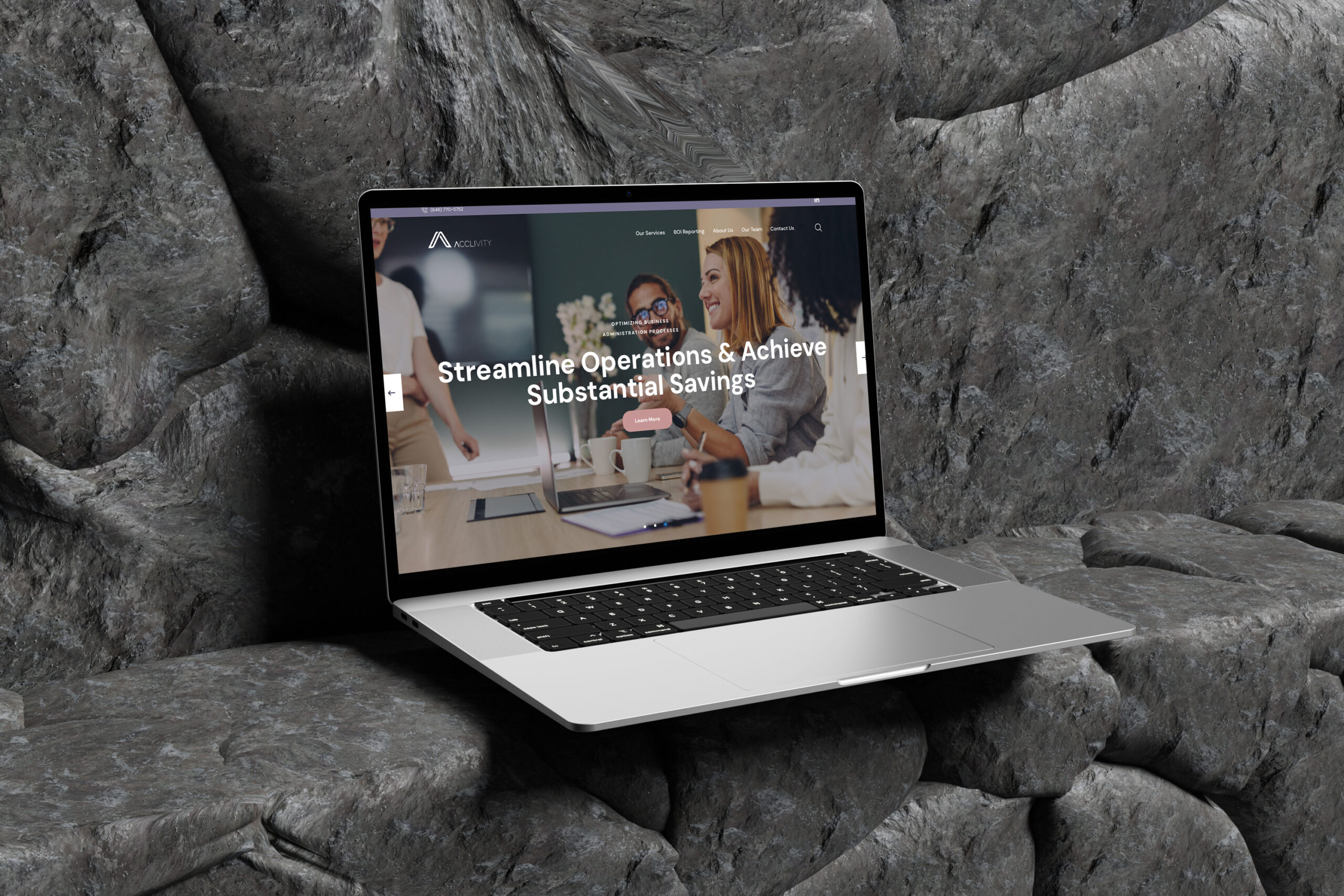
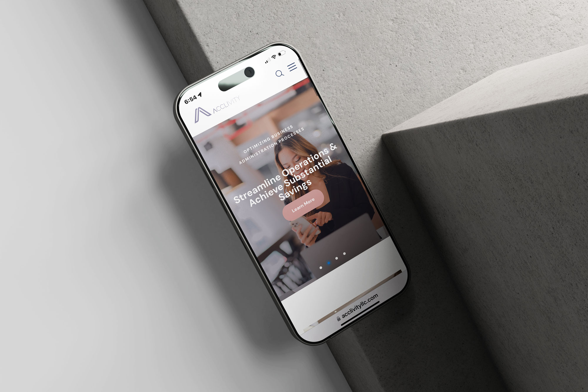
The website for Acclivity is crafted to provide an engaging user experience:

  • Look and Feel: The design is sleek and professional, with a focus on clean lines and ample white space to enhance content visibility.
  • Navigation: Intuitive navigation ensures users can easily find information about services, team members, and contact options.
  • Imagery: High-quality images are used to create a welcoming atmosphere, showcasing teamwork and collaboration.
  • Call-to-Action: Strategically placed buttons encourage user interaction, using the peach accent color to draw attention.

This project showcases a cohesive design approach that effectively communicates Acclivity’s brand values through thoughtful use of color, typography, and layout.

Project Info.

Client Project

Acclivity

Project Date

2022

What Project

Website Design | Logo Design

Head Project.

Angela Alvarez

Web & Logo Designer

The Acclivity project showcases a sophisticated and modern design approach, integrating a harmonious color palette with carefully selected typography. The website’s sleek layout and intuitive navigation enhance user experience, while the versatile logo design reinforces brand identity across various media.

Subscribe Our Newsletter.

Success
Thank you! Form submitted successfully.
This field is required

“Working with Angela was a game-changer for our brand. Her attention to detail and creative vision brought Acclivity to life, delivering a website that is not only visually stunning but also highly functional. The cohesive design elements truly capture our company’s essence.”